


Active Topics
-
Is there a section to talk about Java ME? Apps, etc. (6)
to General by Kalatti - 4 days, 22 hrs ago - more...


|
2010-03-31
, 19:57
|
|
Posts: 52 |
Thanked: 44 times |
Joined on Dec 2008
@ Mississauga, ON
|
#72
|
Originally Posted by Missingbyte

The shade color is adjustable. Simply slide from top to buttom, it should "flip" to the config page and you can change the mood lighting
I vote for flip clock, just think the red needs to go is all and the light grey darker a few shades


__________________
Your friendly neighbourhood geek -- Spenc3
Your friendly neighbourhood geek -- Spenc3
 |
|
2010-03-31
, 20:15
|
|
Posts: 1,839 |
Thanked: 2,432 times |
Joined on May 2009
|
#73
|
Flipclock is nice example. Gpodder is maybe even better example of good design and functions great. Very clean UI with big buttons, pictures of the podcasts, portrait and unique download bar when the device is thinkering.
| The Following User Says Thank You to tissot For This Useful Post: | ||
 |
|
2010-04-01
, 06:11
|
|
Moderator |
Posts: 2,622 |
Thanked: 5,447 times |
Joined on Jan 2010
|
#74
|
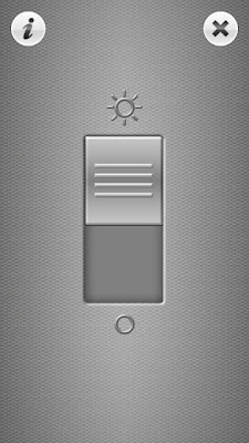
I certainly dislike the i-phone's two way switch alternative to checkbox that sadly made it's way to the harmattan's ui. The checkbox is a super intuitive way of an on-off switch, language and color independent.
________
Novana Residence Condominium Pattaya
Last edited by qwazix; 2011-08-21 at 10:33.
________
Novana Residence Condominium Pattaya
Last edited by qwazix; 2011-08-21 at 10:33.
|
|
2010-04-01
, 07:04
|
|
Posts: 55 |
Thanked: 76 times |
Joined on Dec 2009
|
#75
|
Originally Posted by qwazix
You're right about the language independency. I don't no why, but people like to wipe over their displays. And to be honest, me too. On my old nokia 5800 i replaced phone torch by bright light touch. Phone torch has more functions, but i only need the light on/off feature and bright light is more fun to use...
I certainly dislike the i-phone's two way switch alternative to checkbox that sadly made it's way to the harmattan's ui. The checkbox is a super intuitive way of an on-off switch, language and color independent.

|
|
2010-04-10
, 11:13
|
|
Posts: 92 |
Thanked: 134 times |
Joined on Apr 2010
@ Europe
|
#76
|
Count me in to help designing. I am not a coder, but a fan.
 |
|
2010-04-10
, 11:41
|
|
Posts: 1,391 |
Thanked: 4,272 times |
Joined on Sep 2007
@ Vienna, Austria
|
#77
|
I see two ideas on how to do this as a greater process/project:
What about joining forces and picking a new app/widget every week (that gets proposed by someone in this thread here) and then we all work together and post mock-ups, issues, etc.. and come up with some improvement suggestions that we then communicate to the developer (of course, if possible we should involve the developer during the week too)?
We would obviously need "plain end-users" (who can use the app and tell us what is not clear to them), "graphic designers" (who can do replacement icons, application icons or logos, etc..).
This way, every app gets enough time and thought (~1 week) that can be implemented by the developer {him,her}self or as patches by developers from this thread. Is this something we want to do? Maybe we should create a separate thread in the "Design" forum for each week with the prefix "[UX-WEEK]" or something and the first post is always updated to contain a summary of the current problems, suggestions, mock-ups, etc..?
Some ideas on how the weeks could look like for the "app part" variant of this idea:
The end result of such a "focus week" could be a list of best practices for every part (with screenshots of good and bad examples), a list of affected applications (with the developers contacted and supplied with enough information to implement the ideas - be it patches or artwork, mockups, etc..).
Please also note that UX is not about eye candy only, but mostly about behaviour and what the information is that is displayed (it does not matter if it has iTunes-style reflections and shadows and everything if you have to do some weird gestures to interact with it). Also, colorful icons are nice, but the Maemo 5 UI is more about monochrome white-on-dark "flat" icons without much detail and more focus on the silhouette.
Last edited by thp; 2010-04-10 at 13:58. Reason: "the is information" => "the information is"
- One app/widget every week - discussion focused on making it very usable
- One "app part" every week - Preferences dialog, about dialog, app menus, main view, lists, etc..
What about joining forces and picking a new app/widget every week (that gets proposed by someone in this thread here) and then we all work together and post mock-ups, issues, etc.. and come up with some improvement suggestions that we then communicate to the developer (of course, if possible we should involve the developer during the week too)?
We would obviously need "plain end-users" (who can use the app and tell us what is not clear to them), "graphic designers" (who can do replacement icons, application icons or logos, etc..).
This way, every app gets enough time and thought (~1 week) that can be implemented by the developer {him,her}self or as patches by developers from this thread. Is this something we want to do? Maybe we should create a separate thread in the "Design" forum for each week with the prefix "[UX-WEEK]" or something and the first post is always updated to contain a summary of the current problems, suggestions, mock-ups, etc..?
Some ideas on how the weeks could look like for the "app part" variant of this idea:
- Preferences dialog - We take screenshots of preferences dialogs for our favourite applications, collect "best practices" and compile a list of changes for every app to make the preferences dialogs usable and predictable through the whole Maemo app space
- About dialog - Generate a list of details that every about dialog should have (Bugtracker link, donate link, version number, author, license, website, etc..) and communicate this to the developers of our favourite apps
- Icons - Look for icon usage inside applications and try to make the developers use built-in icons where possible and create icons that fit the built-in style for apps that need special icons
- Lists - Make sure that lists have primary/secondary text, with the correct styling; make sure the list is searchable via keyboard and (where applicable) has a longpress context menu
- Controls - Make sure that the correct control widget is used for a given value (picker button for "one out of a set", a slider for numeric values, no comboboxes at all, etc..) - also, the buttons should have the correct styling (thumb or finger size, not the "flat-looking" default look)
The end result of such a "focus week" could be a list of best practices for every part (with screenshots of good and bad examples), a list of affected applications (with the developers contacted and supplied with enough information to implement the ideas - be it patches or artwork, mockups, etc..).
Please also note that UX is not about eye candy only, but mostly about behaviour and what the information is that is displayed (it does not matter if it has iTunes-style reflections and shadows and everything if you have to do some weird gestures to interact with it). Also, colorful icons are nice, but the Maemo 5 UI is more about monochrome white-on-dark "flat" icons without much detail and more focus on the silhouette.
Last edited by thp; 2010-04-10 at 13:58. Reason: "the is information" => "the information is"
| The Following 16 Users Say Thank You to thp For This Useful Post: | ||
anidel, antoarts, ezcola, Flandry, GeneralAntilles, Haus3r, javispedro, juise-, Laughing Man, lcuk, Moolan, pelago, pycage, shiny, tissot | ||
|
|
2010-04-10
, 18:47
|
|
Posts: 1,391 |
Thanked: 4,272 times |
Joined on Sep 2007
@ Vienna, Austria
|
#78
|
After some thanks and no comments, I just went ahead and created a poll for which topic we want to work on in the first week - let's see if this takes off! Please vote for your favourite topic and then we can start the first week on Monday and see if and how it works
http://talk.maemo.org/showthread.php?t=49686
http://talk.maemo.org/showthread.php?t=49686
|
|
2010-04-11
, 19:05
|
|
Posts: 1,391 |
Thanked: 4,272 times |
Joined on Sep 2007
@ Vienna, Austria
|
#79
|
The vote is closed now (after just one day, but a trial run should be done as early as possible, and it's Sunday already).
This means that we are concentrating on preferences dialogs this week. Please post screenshots of the preferences dialogs of all apps and widgets you have installed and describe the behaviour if something is unclear. Also show the UI to your friends and tell them to interact with it and note any questions or errors that were introduced by bad UI design. Also note things and settings there were well implemented and work well.
Based on this, we can then work on improvement concepts. Please also contact the developers of affected applications so they can chime in in the discussion
 |
|
2010-04-11
, 20:05
|
|
Posts: 805 |
Thanked: 440 times |
Joined on Aug 2009
@ Mississauga, On
|
#80
|
I've been offering to help design for months now, but no one seems too interested. I'm really glad to see that changing. I'm down to help!!
https://bugs.maemo.org/show_bug.cgi?id=9774
I can also see value in the current Gonvert UI and am unsure how I want to handle the two different styles of UI.
770, n810, n900, Ideapad S10-3t
TheOneRing, DialCentral, Gonvert, Quicknote, Multilist, ejpi, nQa, Waters of Shiloah
Programming Blog