


Active Topics
-
Is there a section to talk about Java ME? Apps, etc. (3)
to General by Kalatti - 19 hrs, 57 mins ago - more...

| The Following User Says Thank You to allnameswereout For This Useful Post: | ||
 |

|
2008-11-04
, 22:22
|
|
Posts: 4,930 |
Thanked: 2,272 times |
Joined on Oct 2007
|
#12
|
Originally Posted by allnameswereout

Only if they're suede...
(although blue tends to go pretty easy too; at leasts it is socially accepted to be combined). Same for shoes.
__________________
World's first inductively-charged N900!
World's first inductively-charged N900!
 |
|
2008-11-05
, 02:34
|
|
Posts: 3,397 |
Thanked: 1,212 times |
Joined on Jul 2008
@ Netherlands
|
#13
|
Originally Posted by Benson
I meant black shoes :P
Only if they're suede...
__________________
Goosfraba! All text written by allnameswereout is public domain unless stated otherwise. Thank you for sharing your output!
Goosfraba! All text written by allnameswereout is public domain unless stated otherwise. Thank you for sharing your output!
|
|
2008-11-05
, 03:21
|
|
Posts: 53 |
Thanked: 6 times |
Joined on Sep 2008
|
#14
|
I installed this theme and tried a couple of clicks. I must congratulate the developer for working on this. But I thought the theme is pretty dominating the scene, distracting at times. When the entire world is moving away from borders and barriers, he gave more importance to borders and depth. I think the depth given to borders can be reduced a bit and putting skinny look (like vista or XP world of skins) would make it more appealing. In addition, icons on status bars looked something like they are at the bottom of a well, that gray shade to accommodate status icons is also not appealing. Also, if possible, provide a control panel so that the user can work around with color combination, depth of borders, shade that fills the deep lows on the status bar etc.
I do understand that it is a work in progress...I am sorry but I had to remove it after a couple of clicks. I understand that themes are more of individual preferences and may be there are many other folks who may like it better than I did.
I do understand that it is a work in progress...I am sorry but I had to remove it after a couple of clicks. I understand that themes are more of individual preferences and may be there are many other folks who may like it better than I did.
| The Following User Says Thank You to svrkprabhakar For This Useful Post: | ||
 |
|
2008-11-05
, 11:32
|
|
Posts: 334 |
Thanked: 366 times |
Joined on Nov 2008
@ Italy
|
#15
|
Originally Posted by svrkprabhakar
Im pretty agree with that
I But I thought the theme is pretty dominating the scene, distracting at times.
This skin is more a personal stunt than a serious usable skin.
I personally find it a bit too heavy for daily use but my goal is to make a theme to keep installed on the device and show up at parties
.Ill probably release one version with less 'deep effect' (to avoid the confusing blur between icons and borders).
Thank you for your suggestions
|
|
2008-11-05
, 11:41
|
|
Posts: 334 |
Thanked: 366 times |
Joined on Nov 2008
@ Italy
|
#16
|
Double release: blue and a desaturated black version (to try to accomodate the allnameswereout fashion needs)
The slow boring refinement job continue. I would be glad if someone other could do all the refinements for me...
the direct link to the 8000x800 source png to use in theme maker:
https://garage.maemo.org/frs/downloa...3dmania080.png
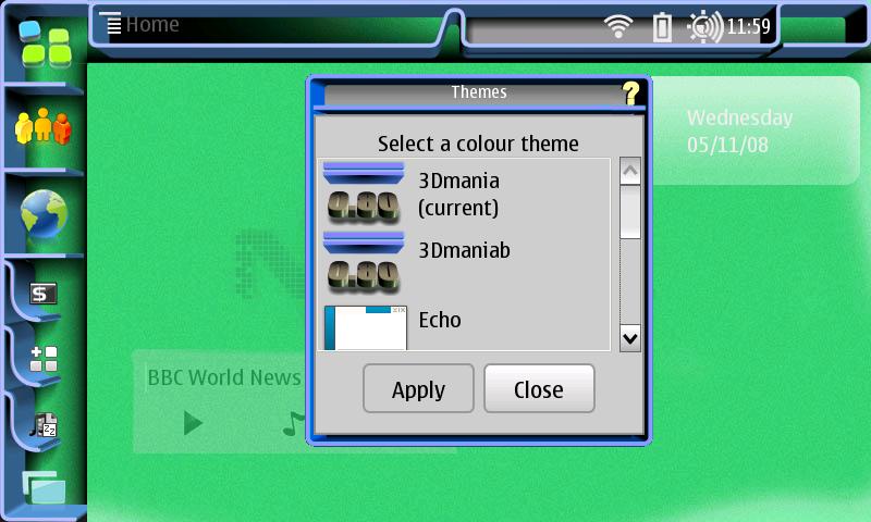
Download the themes from here:
https://garage.maemo.org/frs/?group_id=805
more screenshots:
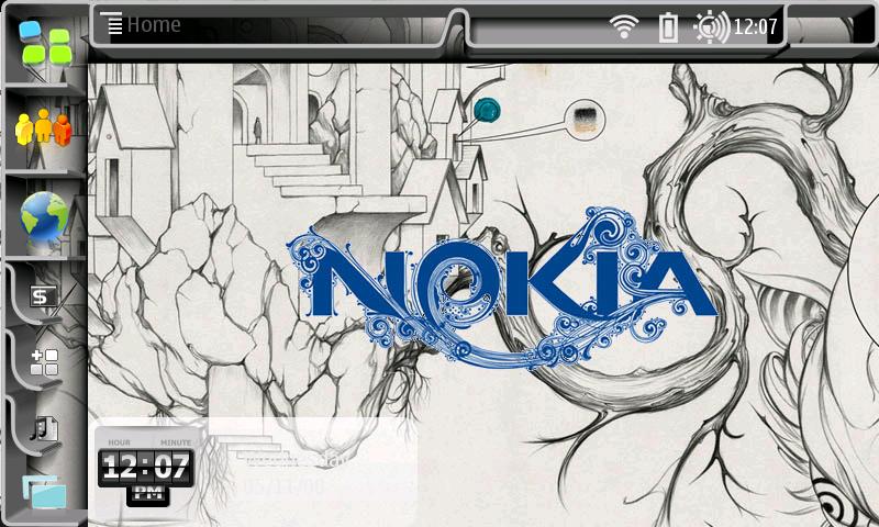
The slow boring refinement job continue. I would be glad if someone other could do all the refinements for me...
the direct link to the 8000x800 source png to use in theme maker:
https://garage.maemo.org/frs/downloa...3dmania080.png
Download the themes from here:
https://garage.maemo.org/frs/?group_id=805
more screenshots:
| The Following User Says Thank You to ciroip For This Useful Post: | ||
|
|
2008-11-05
, 14:37
|
|
Posts: 37 |
Thanked: 0 times |
Joined on Nov 2008
@ Miami Beach
|
#17
|
Thanks amazingly cool!~
Can someone PM on telling me how to get that on mine?
(i'm still a starter)
Thanks,
-Dan-
Can someone PM on telling me how to get that on mine?
(i'm still a starter)
Thanks,
-Dan-
|
|
2008-11-06
, 00:10
|
|
Posts: 3,397 |
Thanked: 1,212 times |
Joined on Jul 2008
@ Netherlands
|
#18
|
Nice background, the second. I'm now using 0.8 black. If I have feedback I'll post it. Just wanted to say: thank you for the black version!!
__________________
Goosfraba! All text written by allnameswereout is public domain unless stated otherwise. Thank you for sharing your output!
Goosfraba! All text written by allnameswereout is public domain unless stated otherwise. Thank you for sharing your output!
| The Following User Says Thank You to allnameswereout For This Useful Post: | ||
|
|
2008-11-06
, 02:31
|
|
Posts: 397 |
Thanked: 99 times |
Joined on Jun 2008
@ Toronto, Ontario
|
#19
|
One thing I notice, when making a selection in a menu, there is no highlight (unless that menu option expands - Edit opens up to the edit menu)
Make it especially difficult to select specific file folders.
Make it especially difficult to select specific file folders.
| The Following User Says Thank You to Nelson L. Squeeko For This Useful Post: | ||
|
|
2008-11-06
, 11:13
|
|
Posts: 334 |
Thanked: 366 times |
Joined on Nov 2008
@ Italy
|
#20
|
Originally Posted by Nelson L. Squeeko
yep, I feel really dumb about but I still cant figure out which color or block to edit is to make it work. Ill keep you update
One thing I notice, when making a selection in a menu, there is no highlight (unless that menu option expands - Edit opens up to the edit menu)
Make it especially difficult to select specific file folders.
Goosfraba! All text written by allnameswereout is public domain unless stated otherwise. Thank you for sharing your output!