


Active Topics
-
Porting apps to Leste (29)
to Maemo 7 / Leste by Arno_11 - 3 days, 18 hrs ago -
Install Fonts in N900 (68)
to Maemo 5 / Fremantle by teroyk - 4 days, 21 hrs ago - more...


|
2019-03-12
, 20:15
|
|
Posts: 1,414 |
Thanked: 7,547 times |
Joined on Aug 2016
@ Estonia
|
#502
|
PS: SFOS would also need regular thin navigation icon (position marker in the middle?) for a menu.
| The Following 5 Users Say Thank You to rinigus For This Useful Post: | ||
 |
|
2019-03-12
, 20:40
|
|
Community Council |
Posts: 1,669 |
Thanked: 10,225 times |
Joined on Nov 2014
@ Lower Rhine
|
#503
|
Originally Posted by rinigus

Ahh, i think i have not fully understood where the nav-to nav-from icons are even used.
PS: SFOS would also need regular thin navigation icon (position marker in the middle?) for a menu.
I was under the impression that row1 nav icons could yield as general nav/route icon and as nav-to icon.
Placing the marker in the middle was confusing so i placed it left bottom.
For the sfos icon there is not much more possible. It already now is very "full" and placing the marker in the middle would need another ball to end the road.
Tried already and that was one reason to go left bottom marker placement.
Banner with removed text is here:
__________________
Watch our weird watchfaces for mighty AsteroidOS
Performance comparison Video Sailfish 2.0 vs 1.1.9 vs 1.1.7
[MC eV] Maemo Community eV membership application please concider to join!
Watch our weird watchfaces for mighty AsteroidOS
Performance comparison Video Sailfish 2.0 vs 1.1.9 vs 1.1.7
[MC eV] Maemo Community eV membership application please concider to join!
| The Following 6 Users Say Thank You to mosen For This Useful Post: | ||
|
|
2019-03-12
, 20:46
|
|
Posts: 1,414 |
Thanked: 7,547 times |
Joined on Aug 2016
@ Estonia
|
#504
|
To and From are used in POI Info page. So, if you click on bookmarked location on a map, click on "i", then you will see a page where they are.
As for SFOS, let it be then as is. Although, while "From" is logically fine, "To" version should probably have a position marker pointed as if you arrived to that location. Right now, its just road direction is swapped. But maybe its OK
As for SFOS, let it be then as is. Although, while "From" is logically fine, "To" version should probably have a position marker pointed as if you arrived to that location. Right now, its just road direction is swapped. But maybe its OK
| The Following 5 Users Say Thank You to rinigus For This Useful Post: | ||
|
|
2019-03-12
, 23:18
|
|
Community Council |
Posts: 1,669 |
Thanked: 10,225 times |
Joined on Nov 2014
@ Lower Rhine
|
#505
|
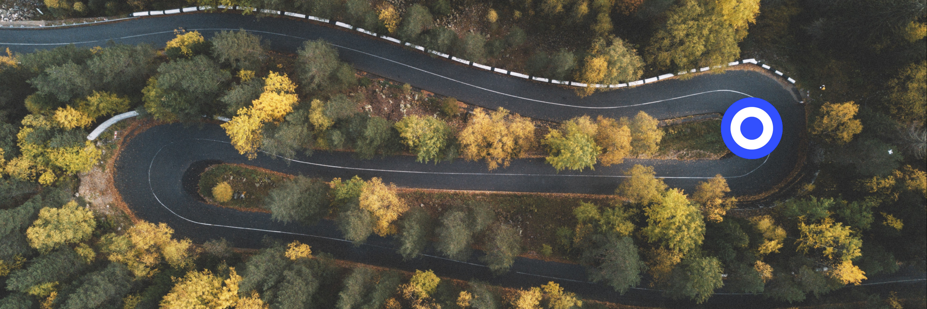
regarding the nearby search, i played with fellfroschs draft. Results in row 3, right is original.
Above that i did an abbreviation from the "marker_stroked" that is used in puremaps also. It looks quite similar to the nearby search icon already used in sailfish and thus could be modified quiet easy to get sailfishified.
The rings should resemble some kind of epi center and give weight compared to the existing icons. Thickness of the rings is same as the road and Magnify glass handle.
The lines should be thick enough to also be usable as kirigami icon when all black.
__________________
Watch our weird watchfaces for mighty AsteroidOS
Performance comparison Video Sailfish 2.0 vs 1.1.9 vs 1.1.7
[MC eV] Maemo Community eV membership application please concider to join!
Watch our weird watchfaces for mighty AsteroidOS
Performance comparison Video Sailfish 2.0 vs 1.1.9 vs 1.1.7
[MC eV] Maemo Community eV membership application please concider to join!
| The Following 9 Users Say Thank You to mosen For This Useful Post: | ||
 |
|
2019-03-13
, 14:20
|
|
Posts: 1,092 |
Thanked: 4,995 times |
Joined on Dec 2009
@ beautiful cave
|
#506
|
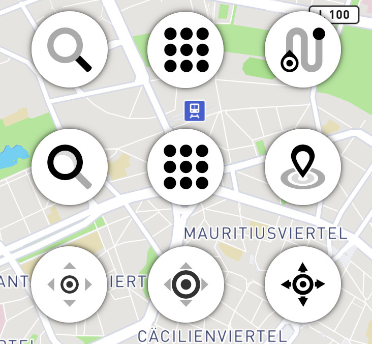
Regarding the nearby search icon:
The middle icon is worse then mine . The left one better
  . I would vote for that one. The epicenter thing is also not that bad, here we should have some feedback from others which one is more intuitive.
Navigation icon is good and well balanced. Nothing irritating anymore.
Search icon in the upper left edge is in my opinion better than that below.
The middle icon is worse then mine
. The left one better . I would vote for that one. The epicenter thing is also not that bad, here we should have some feedback from others which one is more intuitive.Navigation icon is good and well balanced. Nothing irritating anymore.
Search icon in the upper left edge is in my opinion better than that below.
| The Following 7 Users Say Thank You to Fellfrosch For This Useful Post: | ||
 |
|
2019-03-13
, 19:08
|
|
Posts: 173 |
Thanked: 512 times |
Joined on Jul 2018
@ Guatemala
|
#507
|
thanks @mosen for the beautiful icons desing, loooks goood.
-why not put number on icons, to an easy choose/vote?
Last edited by carlosgonz; 2019-03-13 at 19:51.
-why not put number on icons, to an easy choose/vote?
__________________
Nokia N95 / Nokia N900 / Nokia N9 / Nokia N8 / Jolla 1 / Jolla C / Xperia X / Xperia 10 II / PinePhone / Librem 5
TI Chronos
Nokia N95 / Nokia N900 / Nokia N9 / Nokia N8 / Jolla 1 / Jolla C / Xperia X / Xperia 10 II / PinePhone / Librem 5
TI Chronos
Last edited by carlosgonz; 2019-03-13 at 19:51.
|
|
2019-03-13
, 20:17
|
|
Community Council |
Posts: 1,669 |
Thanked: 10,225 times |
Joined on Nov 2014
@ Lower Rhine
|
#508
|
I greatly accept your thanks for investing the time and shift vectors
BUT those icons are true collaborative work in its full beauty! If it was not for Fellfrosch giving his drafts rinigus taking the lead in decision making and your all comments, my things would still be somewhere at this level.
Especially towards Fellfrosch it is important to give credit. I know the feeling if work you did is not visible to the user or even revised like the logo. Only we insiders now that most of the things i did is actually based on his hints and comments.
See the latest nearby markers for example. It may look like i discarded Fellfroschs idea to have a position-marker with arrows as nearby logo.
But actually only while playing around with his approach i realized that arrows are too detailed (for kirigami) and formed them into triangles. Realizing that it is the 4 tips that made the icon look tiny in comparison. The opposite was circles that perfectly could be drawn in fitting line-width. Looking for nearby icon approaches that involved circles online, the epi-center variant struck me and was easily doable in map and all menu versions.
So, regarding credits i would like to ask rinigus to mention everyone in the icon credits that participated with svg drafts in this collaboration.
From you all kindly ignoring the map-layer icon i posted some pages back i concluded it was **** and now simply copied the sfos-layer-icon style to the other variants.
Better like that?
The two lower layers could be same color also, but i tried to introduce 2 transparency stages to look nice with the nearby logo.

This is all simply screenshots from my workflow.
Last edited by mosen; 2019-03-13 at 20:37.
BUT those icons are true collaborative work in its full beauty! If it was not for Fellfrosch giving his drafts rinigus taking the lead in decision making and your all comments, my things would still be somewhere at this level.
Especially towards Fellfrosch it is important to give credit. I know the feeling if work you did is not visible to the user or even revised like the logo. Only we insiders now that most of the things i did is actually based on his hints and comments.
See the latest nearby markers for example. It may look like i discarded Fellfroschs idea to have a position-marker with arrows as nearby logo.
But actually only while playing around with his approach i realized that arrows are too detailed (for kirigami) and formed them into triangles. Realizing that it is the 4 tips that made the icon look tiny in comparison. The opposite was circles that perfectly could be drawn in fitting line-width. Looking for nearby icon approaches that involved circles online, the epi-center variant struck me and was easily doable in map and all menu versions.
So, regarding credits i would like to ask rinigus to mention everyone in the icon credits that participated with svg drafts in this collaboration.
From you all kindly ignoring the map-layer icon i posted some pages back i concluded it was **** and now simply copied the sfos-layer-icon style to the other variants.
Better like that?
The two lower layers could be same color also, but i tried to introduce 2 transparency stages to look nice with the nearby logo.
Originally Posted by carlosgonz
Too lazy
-why not put number on icons, to an easy choose/vote?
This is all simply screenshots from my workflow.
__________________
Watch our weird watchfaces for mighty AsteroidOS
Performance comparison Video Sailfish 2.0 vs 1.1.9 vs 1.1.7
[MC eV] Maemo Community eV membership application please concider to join!
Watch our weird watchfaces for mighty AsteroidOS
Performance comparison Video Sailfish 2.0 vs 1.1.9 vs 1.1.7
[MC eV] Maemo Community eV membership application please concider to join!
Last edited by mosen; 2019-03-13 at 20:37.
| The Following 10 Users Say Thank You to mosen For This Useful Post: | ||
|
|
2019-03-13
, 22:16
|
|
Posts: 1,414 |
Thanked: 7,547 times |
Joined on Aug 2016
@ Estonia
|
#509
|
Re credits: credits are formulated alphabetically right now (see https://github.com/rinigus/pure-maps...utPage.qml#L79) and I fully agree with the assessment of the credits. Note that they were formulated already earlier . Credit for photo is still missing, but that I have to fix after I get back home (on a short trip right now => cannot follow what's going on here either).
. Credit for photo is still missing, but that I have to fix after I get back home (on a short trip right now => cannot follow what's going on here either).
| The Following 8 Users Say Thank You to rinigus For This Useful Post: | ||
|
|
2019-03-15
, 02:56
|
|
Posts: 127 |
Thanked: 313 times |
Joined on Sep 2016
@ Yekaterinbourg, Russia
|
#510
|
@rinigus. I'm sorry for question about another application - SystemDataScope. It's a similar story with album orientation: Time->Main_graphs->empty screen
| The Following 3 Users Say Thank You to XOleg For This Useful Post: | ||
It all looks really great, thank you! I presume we will make thinner icon at https://talk.maemo.org/showpost.php?...&postcount=492 for Nearby, right?